Jan 15, 2013
|Last updated on October 20th, 2020 at 08:29 am
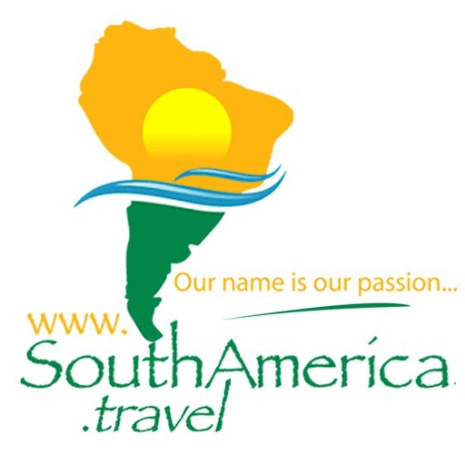
 Ever wondered where we got our colorful logo? (See image to the right). The history of the SouthAmerica.travel logo is a fascinating one. Read on to find out more about our logo, our company history, and the trials and tribulations of finding the perfect logo to represent our brand. It’s a real blast from the past! Back in 1999, when the company was just in nascent form, co-founders Juergen Keller and Bradley Nehring called their tour company Universal Understanding, with the idea of “bringing people together to better understand other cultures,” according to Juergen. The duo specialized in Brazil tours with the website 4starBrazil.com and had no intention of expanding to other countries in South America. But in 2001, the founders added 4starArgentina, 4starChile, followed by 4starBolivia and 4starPeru in 2002, each with their own distinctive logos. Only after adding these sites did they create one overarching site (and name): 4starSouthAmerica.
Here is one of the early logos used for 4starBrazil.com:
From 2001 to 2010, the logo consisted of various versions of Papyrus script, in the colors of each country’s flag. For 4starArgentina.com, where the company listed all its Argentina Tours, this was the banner:
And here is the banner for 4starPeru.com, where the company listed all its Peru Tours:
As you can see with these early logos, the founders decided to play around with fonts, colors, and arrangements, finally settling on the Papyrus font, with forest green to represent the forests and jungles of South America. “We chose the colors to reflect colors we associated with Brazil,” explained Bradley Nehring. “The deep green reflecting the nature (forests, jungles) and the flag of Brazil, and the brown of the mountains, earth, and “Brasil wood” from which the country got its name.” When adding the other sites, the founders tried to maintain this color scheme idea, using the colors of the Chilean, Argentine and Peruvian flags in the logos of the respective countries. (See the Argentina and Peru logos above). In 2007, the company was awarded the coveted website domain name www.SouthAmerica.travel, by Tralliance, the administrator of .travel domain names.
By 2009, the company was known as SouthAmerica.travel (pronounced “South America Dot Travel”), and all 4starSouthAmerica sites were consolidated on the SouthAmerica.travel website. In 2010, the founders decided to settle on an official logo that would represent the whole company. They asked for inspiration from a number of specialists in logo creation.
Surprisingly, the best designs came from a company in India, which offered 11 designs from 11 different designers. The result was the current logo, a bold & colorful icon consisting of a stylized image of the continent of South America as the backdrop, split horizontally with a blue wave representing the oceans. The top half of the continent was orange with an overlay of the sun, representing the golden beaches and sunshine of South America. The bottom half was forest green, symbolizing the forests and jungles of South America:
“Only when a colleague in our Buenos Aires office pointed out that the logo reflected the colors of Brazil did I realize that elements of our original logo — the colors of Brazil, the Papyrus font, indicative of the forest — survived to the final logo. That was a bonus – a logo reflecting our roots!” But choosing among the 11 different prototypes sent by the logo company had been … amusing. Some of the other contenders were quite good, including this one, where something just didn’t seem to be quite right:  (Perhaps a penguin or piranha would have been more appropriate!)


